읽기 전
- 불필요한 코드나 잘못 작성된 내용에 대한 지적은 언제나 환영합니다.
- 개인적으로 사용해보면서 배운 점을 정리한 글입니다.
Jetpack Compose의 레이아웃 코드랩에서 실습한 내용들을 정리합니다. 레이아웃 컴포저블을 사용하여 좀 더 고도화된 커스텀 레이아웃을 정의합니다. 코드랩 실습에 요구되는 시간은 대략 1시간 정도로 학습 목적을 고려하면 대략 2 - 3시간 정도를 투자해야 합니다. 분량이 너무 많아 챕터 별로 분할하여 업로드합니다.
고도화된 커스텀 레이아웃 - StaggeredGrid
Layout 컴포저블을 사용하여 기본적인 컴포저블을 재현해봤다. 좀 더 발전시켜서 복잡한 커스텀 레이아웃을 작성해보자. 코드랩에서 제시하는 커스텀 레이아웃은 Material Design 예제 프로젝트 - Owl의 지그재그형 그리드다.

가운데 배치된 지그재그형 그리드는 통상적인 Column과 Row로 구현하기에는 조금 번잡한 면이 있다. 받아오는 데이터 구조가 Column 단위로 쪼개서 Row로 나열할 수 있도록 구성되어 있으면 가능하겠으나 가급적 한 번에 모든 구획을 채워지게끔 만들고 싶다.
커스텀 레이아웃을 정의하면 데이터 구조에 대해 고민할 필요 없이 모든 항목의 높이를 측정하고 제한하여 배치할 수 있다. 재사용성을 위해 row는 커스텀할 수 있도록 매개변수로 전달하자.
@Composable
fun StaggeredGrid(
    modifier: Modifier = Modifier,
    rows: Int = 3,
    content: @Composable () -> Unit
) {
    Layout(
        modifier = modifier,
        content = content
    ) { measurables, constraints ->
        // 주어진 제약조건에 따라 자식 요소를 측정하고 배치
    }
}
커스텀 레이아웃이지만 앞서 작성했듯이 Layout 컴포저블 선언 - 자식 요소 측정 - 자식 요소 배치의 구조를 띌 것이다.
이제껏 그래왔듯이, 추가적인 제약조건 정의는 하지 않고 하위 요소는 한 번만 측정할 수 있음을 유념하자.
Layout(
    modifier = modifier,
    content = content
) { measurables, constraints ->

    // 각 행의 너비를 추적 - 초기값은 0
    val rowWidths = IntArray(rows) { 0 }

    // 각 열의 최대 높이를 추적 - 초기값은 0
    val rowHeights = IntArray(rows) { 0 }

    // 자식 요소에 추가 제약 없이 주어진 제약조건대로 측정
    // 측정된 자식들이 담긴 리스트 반환
    val placeables = measurables.mapIndexed { index, measurable ->

        // 각 자식 요소 측정
        val placeable = measurable.measure(constraints)

        // 각 행에 대해 너비와 최대 높이 추적
        // item이 배치될 행 좌표를 index % 최대 행 개수로 계산하여 균등하게 배분
        val row = index % rows
        // 배치 후 너비 반영
        rowWidths[row] += placeable.width
        // 배치 후 높이 반영(현재 높이와 배치한 아이템의 높이 비교하여 최대값 반영)
        rowHeights[row] = Math.max(rowHeights[row], placeable.height)
        // 자식 요소 배치
        placeable
    }
    ...
}
위 코드에서 주석 처리한 설명처럼 각 행의 너비와 높이를 추적하여 반영한다.
하위 요소의 배치 로직을 작성하였으므로 화면에 배치하기 전 전체 그리드의 너비와 높이를 결정해야 한다.
Layout(
    content = content,
    modifier = modifier
) { measurables, constraints ->
    ...

    // 그리드의 너비는 가장 넓은 너비의 행과 동일하다.
    val width = rowWidths.maxOrNull()
        ?.coerceIn(constraints.minWidth.rangeTo(constraints.maxWidth)) ?: constraints.minWidth

    // 그리드의 높이는 각 행의 가장 기다란 요소의 높이들을 더한 값이다.
    // 높이 제약 조건으로 강제하였음
    val height = rowHeights.sumOf { it }
        .coerceIn(constraints.minHeight.rangeTo(constraints.maxHeight))

    // 각 행의 Y값은 이전 행의 높이 누적값이다.
    val rowY = IntArray(rows) { 0 }
    for (i in 1 until rows) {
        rowY[i] = rowY[i-1] + rowHeights[i-1]
    }

    ...
}
하위 요소의 배치 로직에 따라 각 행의 너비와 최대 높이는 확보하였으므로 해당 값들을 기반으로 그리드 레이아웃의 전체 너비와 높이를 결정한다.
마지막으로 하위 요소들을 placeable.placeRelative(x, y)를 호출하여 화면에 하위 요소를 배치한다.
Layout(
    content = content,
    modifier = modifier
) { measurables, constraints ->
    ...

    // 부모 레이아웃의 사이즈 지정
    layout(width, height) {
        // row마다 아이템이 배치될 X좌표
        val rowX = IntArray(rows) { 0 }

        placeables.forEachIndexed { index, placeable ->
            val row = index % rows
            placeable.placeRelative(
                x = rowX[row],
                y = rowY[row]
            )
            rowX[row] += placeable.width
        }
    }
}
rowX 변수는 하위 아이템을 배치하면서 변경되기에 layout 함수 scope에 선언되었다. 이로써 rowX, rowY 변수를 사용하여 x, y 변수를 추적한다.
StaggeredGrid 아이템 정의
@Composable
fun Chip(modifier: Modifier = Modifier, text: String) {
    Card(
        modifier = modifier,
        border = BorderStroke(color = Color.Black, width = Dp.Hairline),
        shape = RoundedCornerShape(8.dp)
    ) {
        Row(
            modifier = Modifier.padding(start = 8.dp, top = 4.dp, end = 8.dp, bottom = 4.dp),
            verticalAlignment = Alignment.CenterVertically
        ) {
            Box(
                modifier = Modifier.size(16.dp, 16.dp)
                    .background(color = MaterialTheme.colors.secondary)
            )
            Spacer(Modifier.width(4.dp))
            Text(text = text)
        }
    }
}

@Preview
@Composable
fun ChipPreview() {
    LayoutsCodelabTheme {
        Chip(text = "Hi there")
    }
}
앞서 정의한 커스텀 레이아웃인 StaggeredGrid 레이아웃에 넣을 아이템 레이아웃을 정의해야 한다. 좌측에 placeholder를 정의하고 우측에 파라미터로 받은 텍스트를 표시한다. 코드대로 작성한 경우 미리보기는 다음과 같다.

StaggeredGrid의 전체 코드는 다음과 같다.
@Composable
fun StaggeredGrid(
    modifier: Modifier = Modifier,
    rows: Int = 3,
    content: @Composable () -> Unit
) {
    Layout(
        modifier = modifier,
        content = content
    ) { measurables, constraints ->
        // 각 행의 너비를 추적 - 초기값은 0
        val rowWidths = IntArray(rows) { 0 }

        // 각 열의 최대 높이를 추적 - 초기값은 0
        val rowHeights = IntArray(rows) { 0 }

        // 자식 요소에 추가 제약 없이 주어진 제약조건대로 측정
        // 측정된 자식들이 담긴 리스트 반환
        val placeables = measurables.mapIndexed { index, measurable ->

            // 각 자식 요소 측정
            val placeable = measurable.measure(constraints)

            // 각 행에 대해 너비와 최대 높이 추적
            // item이 배치될 행 좌표를 index % 최대 행 개수로 계산하여 균등하게 배분
            val row = index % rows
            // 배치 후 너비 반영
            rowWidths[row] += placeable.width
            // 배치 후 높이 반영(현재 높이와 배치한 아이템의 높이 비교하여 최대값 반영)
            rowHeights[row] = Math.max(rowHeights[row], placeable.height)
            // 자식 요소 배치
            placeable
        }
        // 그리드의 너비는 가장 넓은 너비의 행과 동일하다.
        val width = rowWidths.maxOrNull()
            ?.coerceIn(constraints.minWidth.rangeTo(constraints.maxWidth)) ?: constraints.minWidth

        // 그리드의 높이는 각 행의 가장 기다란 요소의 높이들을 더한 값이다.
        // 높이 제약 조건으로 강제하였음
        val height = rowHeights.sumOf { it }
            .coerceIn(constraints.minHeight.rangeTo(constraints.maxHeight))


        // 각 행의 Y값은 이전 행의 높이 누적값이다.
        val rowY = IntArray(rows) { 0 }
        for (i in 1 until rows) {
            rowY[i] = rowY[i-1] + rowHeights[i-1]
        }

        // 부모 레이아웃의 사이즈 지정
        layout(width, height) {

            // row마다 아이템이 배치될 X좌표
            val rowX = IntArray(rows) { 0 }

            placeables.forEachIndexed { index, placeable ->
                val row = index % rows
                placeable.placeRelative(
                    x = rowX[row],
                    y = rowY[row]
                )
                rowX[row] += placeable.width
            }
        }
    }
}
StaggeredGrid에 들어갈 텍스트 아이템들을 하드코딩된 배열로 작성하고 실제로 호출해보자.
val topics = listOf(
    "Arts & Crafts", "Beauty", "Books", "Business", "Comics", "Culinary",
    "Design", "Fashion", "Film", "History", "Maths", "Music", "People", "Philosophy",
    "Religion", "Social sciences", "Technology", "TV", "Writing"
)

@Preview
@Composable
fun LayoutCodelabPreview() {
    LayoutsCodelab()
}

@Composable
fun LayoutsCodelab() {
    Scaffold(
        topBar = {
            TopAppBar(
                title = {
                    Text(text = "LayoutsCodelab")
                },
                actions = {
                    IconButton(onClick = { /* doSomething() */ }) {
                        Icon(Icons.Filled.Favorite, contentDescription = null)
                    }
                }
            )
        }
    ) { innerPadding ->
        BodyContent()
    }
}

@Composable
fun BodyContent(modifier: Modifier = Modifier) {
    StaggeredGrid(modifier = modifier) {
        for (topic in topics) {
            Chip(modifier = Modifier.padding(8.dp), text = topic)
        }
    }
}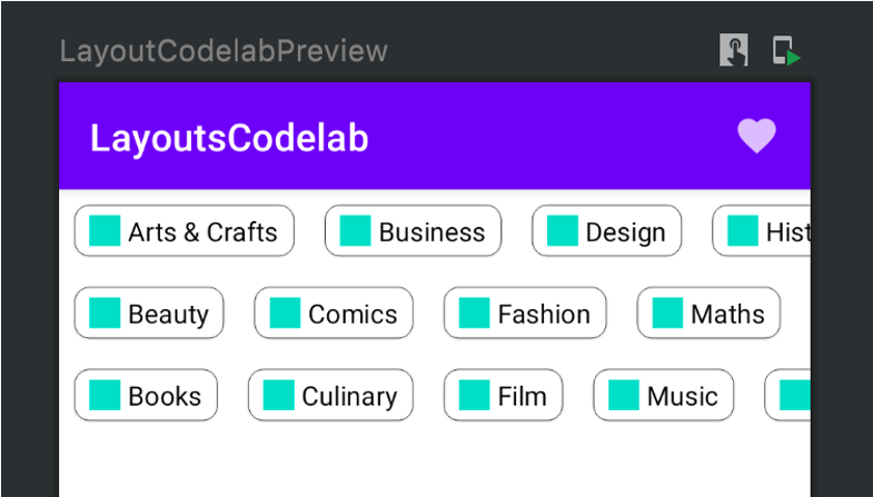
허나 이렇게 사용하면 preview에서 볼 수 있듯이 화면 너비를 넘어가는 경우 가로로 스크롤할 수 없다. 가로 스크롤 속성을 부여할 수 있는 Row로 래핑하고 BodyContent 컴포저블 함수의 Modifier 파라미터를 StaggeredGrid가 아니라 Row 컴포저블에 전달하여 스크롤 가능하게 구현할 수 있다.
@Composable
fun BodyContent(modifier: Modifier = Modifier) {
    Row(modifier = modifier.horizontalScroll(rememberScrollState())) {
        StaggeredGrid {
            for (topic in topics) {
                Chip(modifier = Modifier.padding(8.dp), text = topic)
            }
        }
    }
}
참고자료
'Android' 카테고리의 다른 글
| Codelab | Jetpack Compose layout - Intrinsic Measure (0) | 2022.07.24 |
|---|---|
| Codelab | Jetpack Compose layout - ConstraintLayout (0) | 2022.07.24 |
| Codelab | Jetpack Compose layout - Custom Layout (0) | 2022.07.24 |
| Codelab | Jetpack Compose layout - Use List (0) | 2022.07.24 |
| Codelab | Jetpack Compose layout - Material Component (0) | 2022.07.24 |